Amplify: The Customer Data that Matters
Designed the full identity for Amplify 2026 - Amperity annual conference that brought together industry leaders to explore how data bridges the gap between you and the brand
Branding
Designed the full identity for Amplify 2026 - Amperity annual conference that brought together industry leaders to explore how data bridges the gap between you and the brand
Branding

Saas, AI, Tech
Brand Identity, Event Marketing, Photography
Brand designer
May 2026
Saas, AI, Tech
Brand designer
Brand Identity, Event Marketing, Photography
May 2026
In close partnership with the Brand Design Lead and Content Strategy team, I helped create the complete identity for Amplify 2026, Amperity’s annual conference. The event brought together industry leaders to explore how data can bridge the gap between brands and the customers they serve.
In close partnership with the Brand Design Lead and Content Strategy team, I helped create the complete identity for Amplify 2026, Amperity’s annual conference. The event brought together industry leaders to explore how data can bridge the gap between brands and the customers they serve.
In close partnership with the Brand Design Lead and Content Strategy team, I helped create the complete identity for Amplify 2026, Amperity’s annual conference. The event brought together industry leaders to explore how data can bridge the gap between brands and the customers they serve.
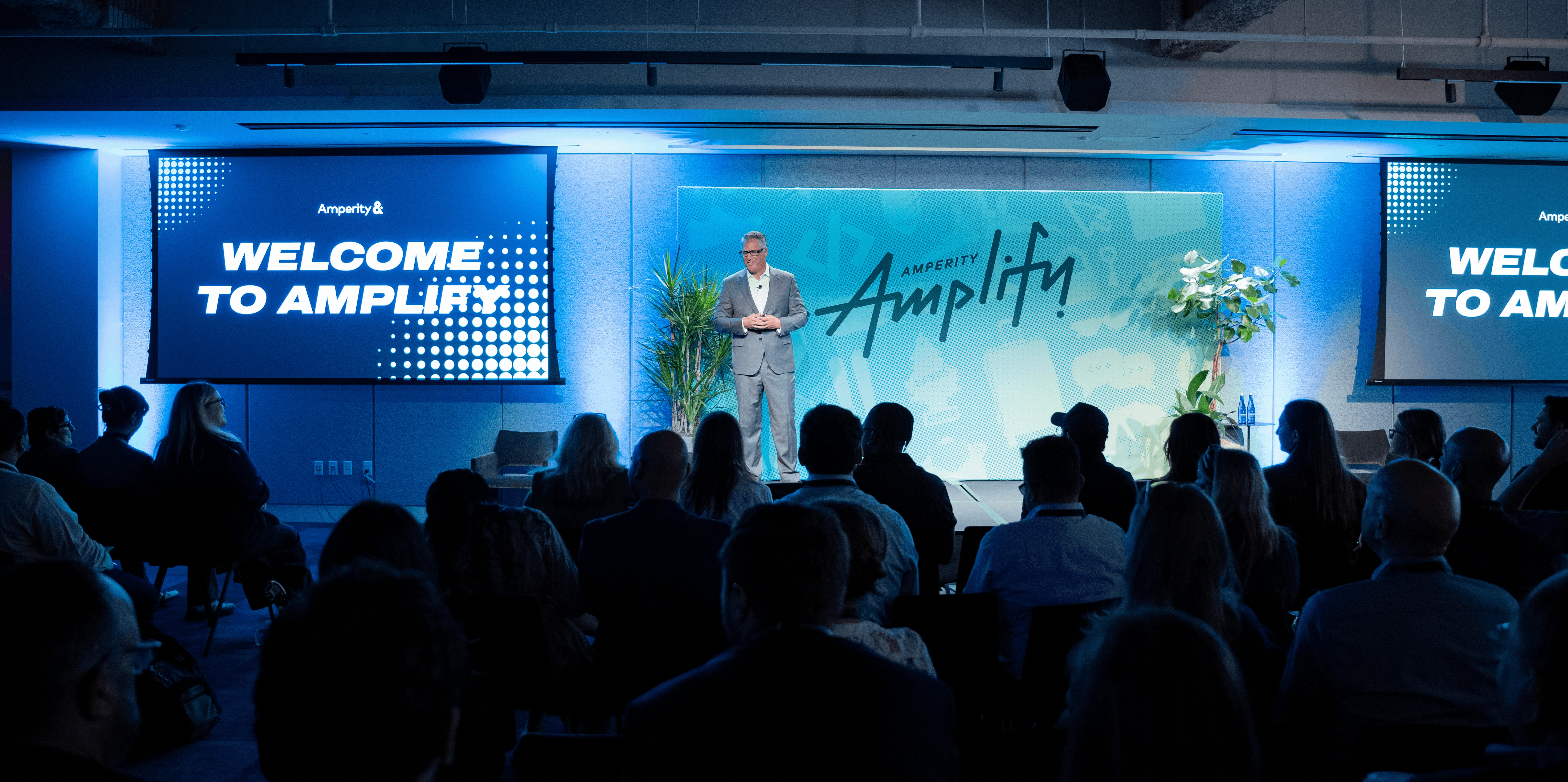
Photography: FramebyFrame
Amplify 2026 was an important opportunity to introduce Amperity’s refreshed brand expression while maintaining continuity with its core identity.
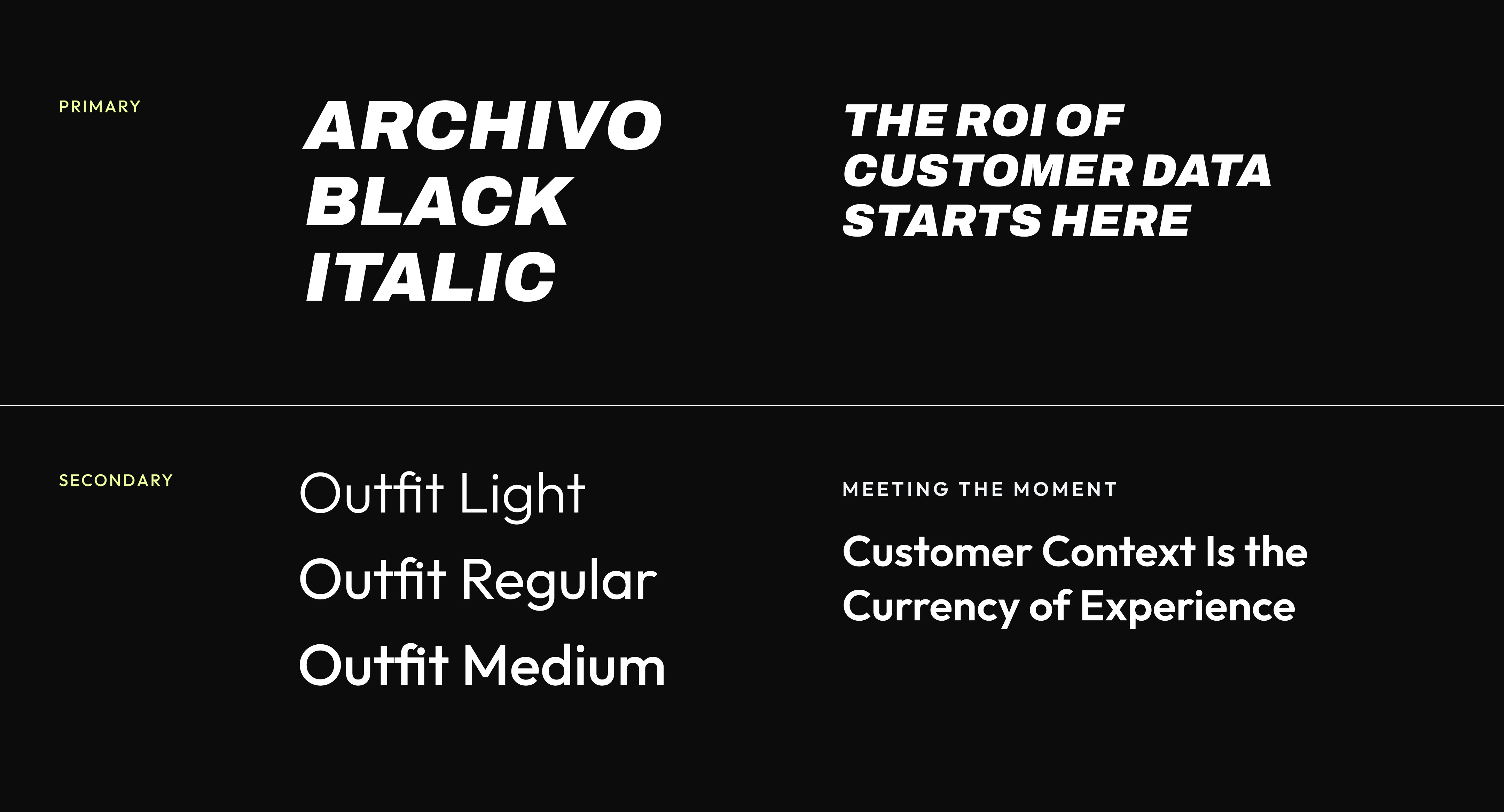
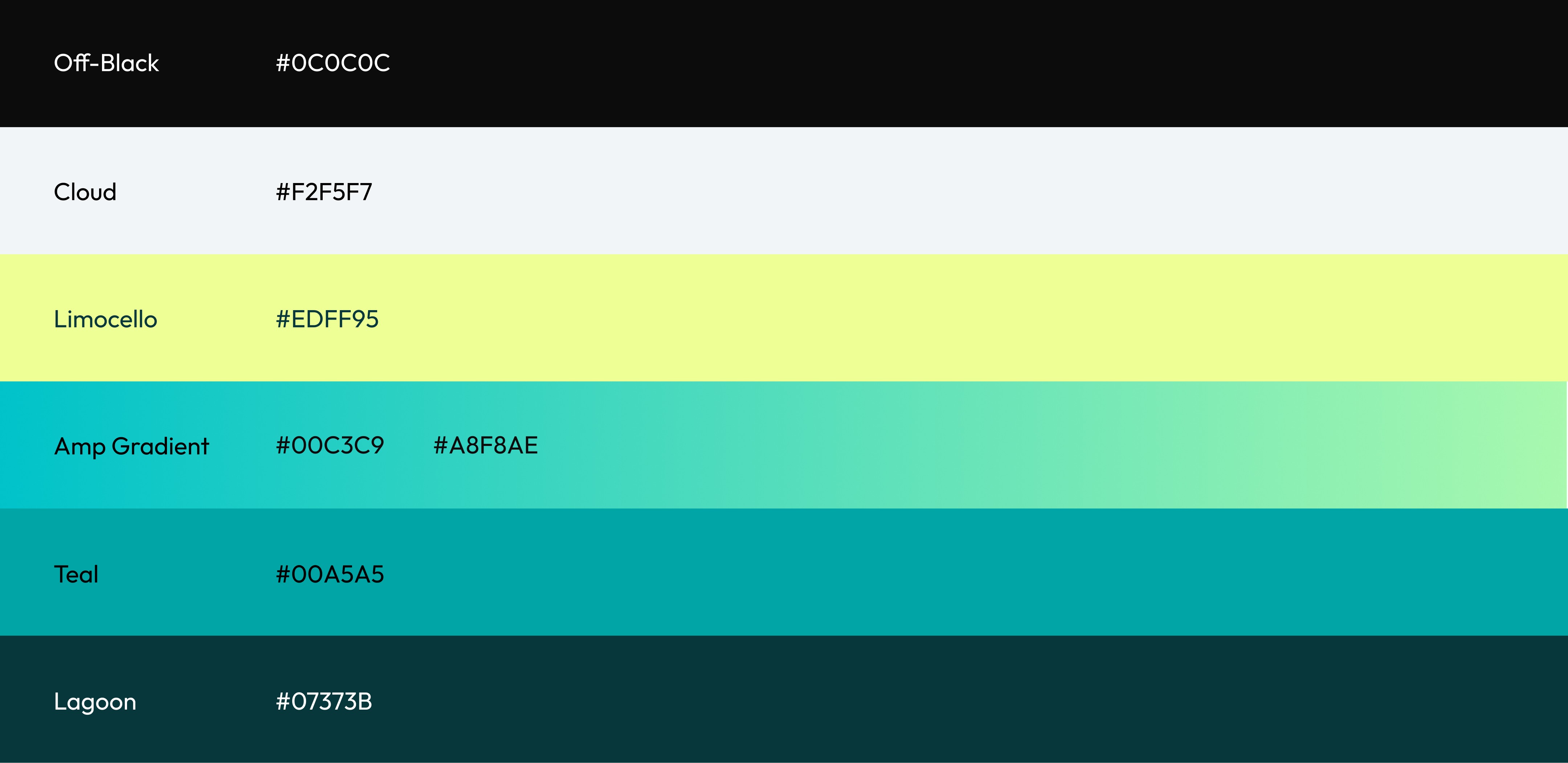
We developed a refined visual system built around a minimal color palette, elevated typography, and elements inspired by previous Amplify event logos. The concept needed to be both distinctive and highly flexible, scaling seamlessly across social content, large-format digital screens, web experiences, environmental graphics, and physical activations.
Amplify 2026 was an important opportunity to introduce Amperity’s refreshed brand expression while maintaining continuity with its core identity.
We developed a refined visual system built around a minimal color palette, elevated typography, and elements inspired by previous Amplify event logos. The concept needed to be both distinctive and highly flexible, scaling seamlessly across social content, large-format digital screens, web experiences, environmental graphics, and physical activations.
Amplify 2026 was an important opportunity to introduce Amperity’s refreshed brand expression while maintaining continuity with its core identity.
We developed a refined visual system built around a minimal color palette, elevated typography, and elements inspired by previous Amplify event logos. The concept needed to be both distinctive and highly flexible, scaling seamlessly across social content, large-format digital screens, web experiences, environmental graphics, and physical activations.
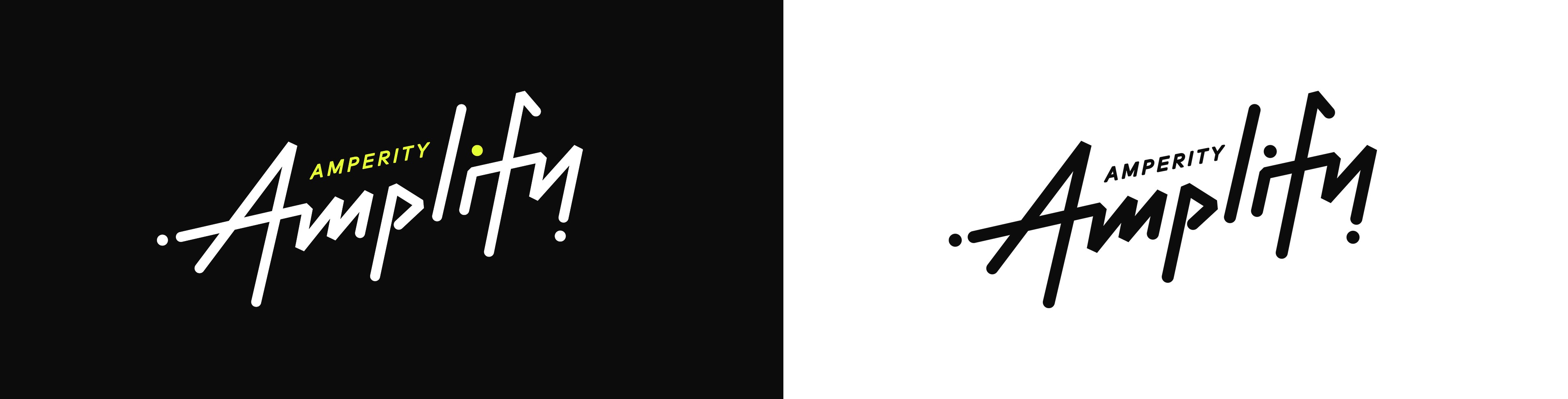
Reusing custom typo logo from previous year to preserve consistency and awareness
The primary goal of the social campaign was to drive event registration and build momentum leading up to the conference.
We created a daily content series promoting keynote sessions and featured speakers, including industry-leading Amperity customers. Speaker photography used a consistent black-and-white treatment with dramatic studio lighting, giving the campaign a confident and editorial feel while keeping the focus on each individual and their story.
The primary goal of the social campaign was to drive event registration and build momentum leading up to the conference.
We created a daily content series promoting keynote sessions and featured speakers, including industry-leading Amperity customers. Speaker photography used a consistent black-and-white treatment with dramatic studio lighting, giving the campaign a confident and editorial feel while keeping the focus on each individual and their story.
The primary goal of the social campaign was to drive event registration and build momentum leading up to the conference.
We created a daily content series promoting keynote sessions and featured speakers, including industry-leading Amperity customers. Speaker photography used a consistent black-and-white treatment with dramatic studio lighting, giving the campaign a confident and editorial feel while keeping the focus on each individual and their story.


For the Amplify registration experience, we translated the visual identity into a digital system that felt expressive while remaining simple, intuitive, and functional.
Because the agenda was a major factor in attendees’ registration decisions, we created a clear hierarchy across both tracks, highlighted speaker information, and ensured the experience was highly responsive on mobile devices.
We also worked closely with the Content Strategy team to make the messaging more approachable and educational. A section featuring highlights from previous events was added to provide context, build credibility, and help prospective attendees understand what to expect.
For the Amplify registration experience, we translated the visual identity into a digital system that felt expressive while remaining simple, intuitive, and functional.
Because the agenda was a major factor in attendees’ registration decisions, we created a clear hierarchy across both tracks, highlighted speaker information, and ensured the experience was highly responsive on mobile devices.
We also worked closely with the Content Strategy team to make the messaging more approachable and educational. A section featuring highlights from previous events was added to provide context, build credibility, and help prospective attendees understand what to expect.
For the Amplify registration experience, we translated the visual identity into a digital system that felt expressive while remaining simple, intuitive, and functional.
Because the agenda was a major factor in attendees’ registration decisions, we created a clear hierarchy across both tracks, highlighted speaker information, and ensured the experience was highly responsive on mobile devices.
We also worked closely with the Content Strategy team to make the messaging more approachable and educational. A section featuring highlights from previous events was added to provide context, build credibility, and help prospective attendees understand what to expect.
To bring the Amplify identity to life in the physical space, we developed three stage concepts that explored how the visual system could scale across large-format screens, speaker presentations, and live programming.
The mockups helped us test composition, hierarchy, legibility, and brand consistency before production. Each concept was designed to support a different moment in the event—from keynote storytelling and customer conversations to product demonstrations—while still feeling like part of one cohesive experience.
To bring the Amplify identity to life in the physical space, we developed three stage concepts that explored how the visual system could scale across large-format screens, speaker presentations, and live programming.
The mockups helped us test composition, hierarchy, legibility, and brand consistency before production. Each concept was designed to support a different moment in the event—from keynote storytelling and customer conversations to product demonstrations—while still feeling like part of one cohesive experience.
To bring the Amplify identity to life in the physical space, we developed three stage concepts that explored how the visual system could scale across large-format screens, speaker presentations, and live programming.
The mockups helped us test composition, hierarchy, legibility, and brand consistency before production. Each concept was designed to support a different moment in the event—from keynote storytelling and customer conversations to product demonstrations—while still feeling like part of one cohesive experience.


Check in desk for guest to pickup badges


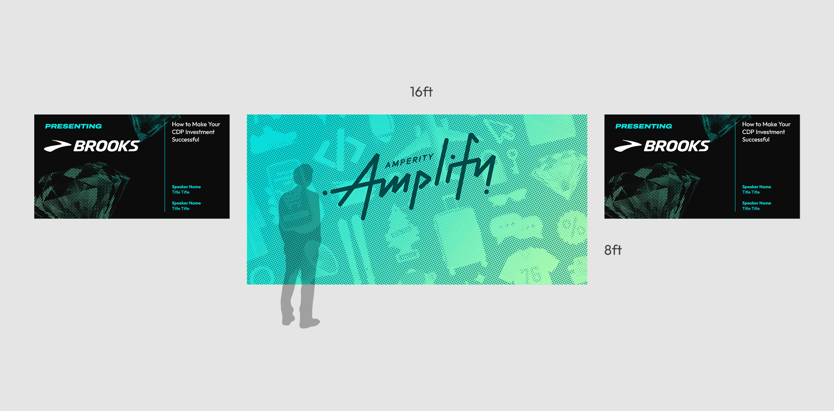

Main Stage
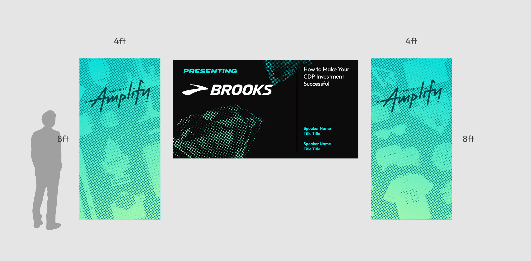

Technology Breakout Room

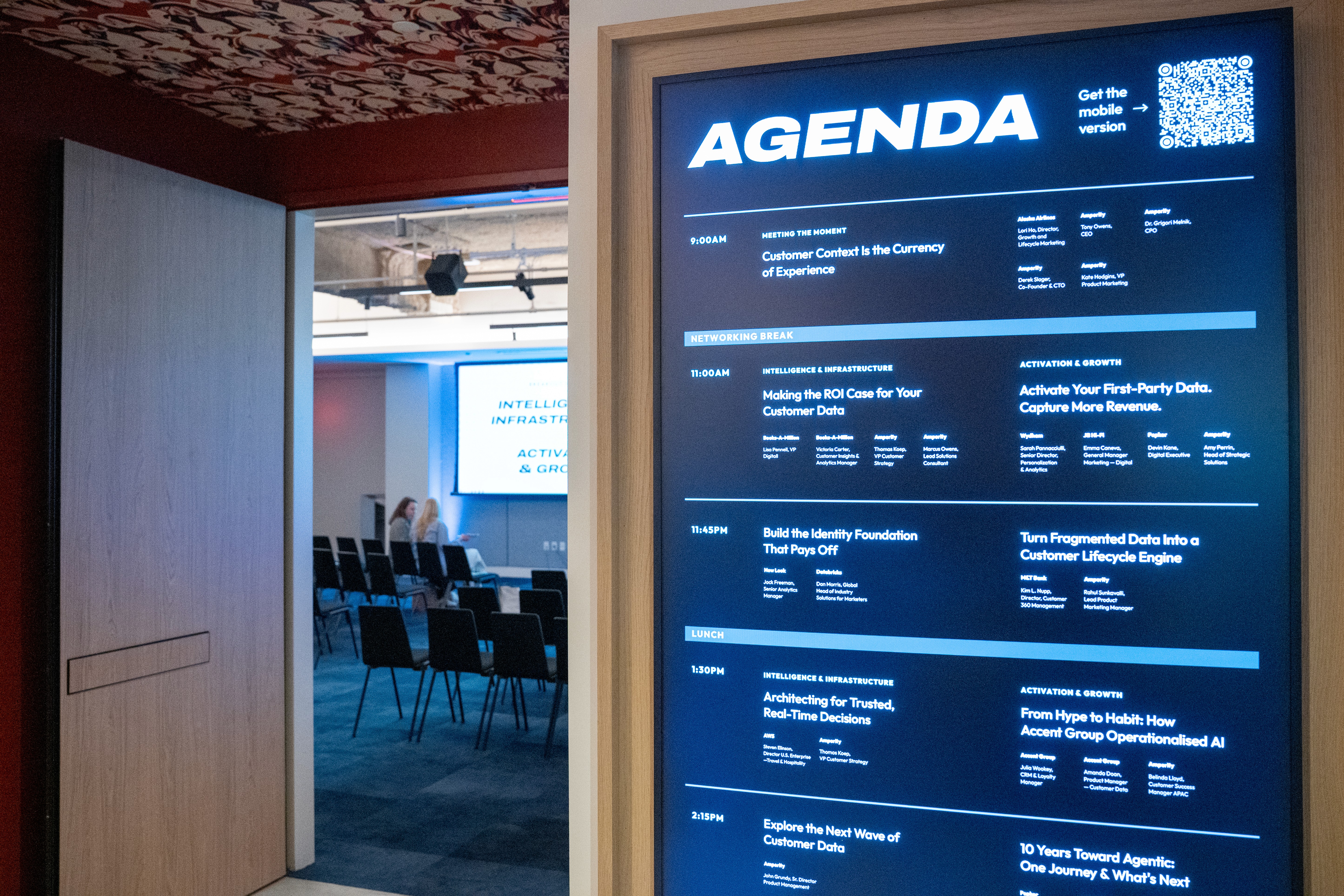
With two conference tracks running simultaneously, the agenda and wayfinding system needed to help attendees quickly understand their options and confidently navigate the event.
The design prioritized clear scheduling, prominent speaker information, track differentiation, and concise session summaries. This allowed guests to compare sessions at a glance, understand the key takeaways, and decide which track was most relevant to them.
With two conference tracks running simultaneously, the agenda and wayfinding system needed to help attendees quickly understand their options and confidently navigate the event.
The design prioritized clear scheduling, prominent speaker information, track differentiation, and concise session summaries. This allowed guests to compare sessions at a glance, understand the key takeaways, and decide which track was most relevant to them.
With two conference tracks running simultaneously, the agenda and wayfinding system needed to help attendees quickly understand their options and confidently navigate the event.
The design prioritized clear scheduling, prominent speaker information, track differentiation, and concise session summaries. This allowed guests to compare sessions at a glance, understand the key takeaways, and decide which track was most relevant to them.

“It takes a village to bring an event like this to life, and this week was a reflection of the talent, teamwork, creativity, and hustle across this organization.”
— Tara Nesbitt, Growth Marketing Lead
Following the event, we received thoughtful messages from customers who were excited to learn more about Amperity’s latest product capabilities and explore how they could apply them to their businesses.
attendees
customers
demo sessions
attendees
customers
demo sessions
attendees
customers
demo sessions


Reception & Networking hour